Data Visualization
A page containing (an updating) visualizations from various projects and occasions.
Visualizations titles are linked referencing either to the source code or to a gallery. Only selected visualizations are shown below.
Enjoy!
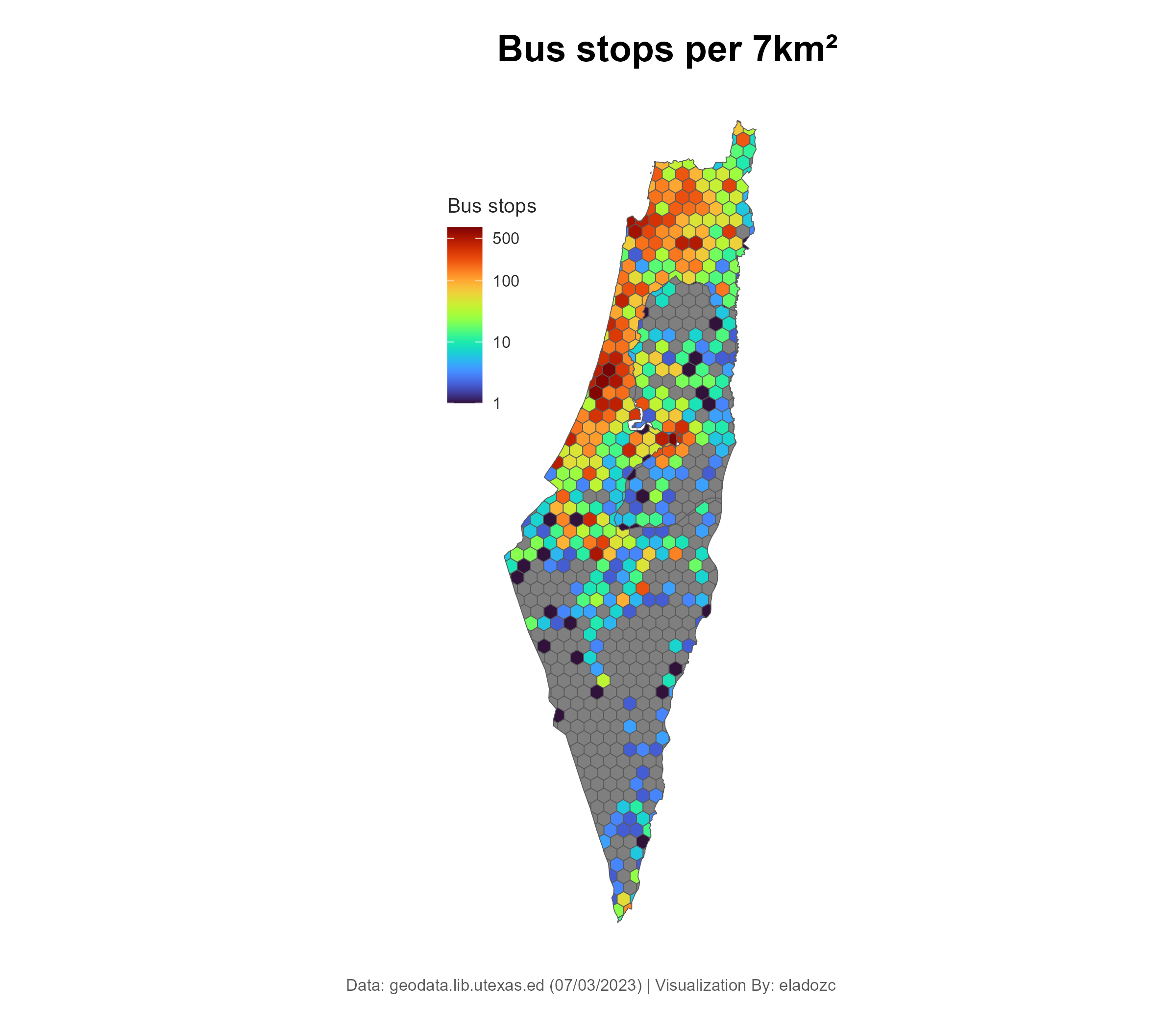
Israel Bus Stops Density
In this project, I visualized the amount of bus stops per 7 squared kilometers. And as indicated from the plot, the density is proportional to one’s distance to the central districts of Israel.
I find this conclusion to be alarming since it indicates an alarming discrepancies of oppertunites as a functions of one’s living.
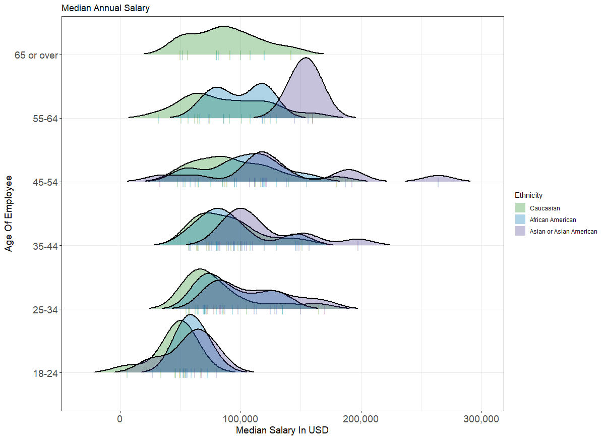
Ask A Manager
This plot depicts the various annual median salary distributions as a function of ethnicity & age interval. The data was obtained via the ‘Ask A Manager’ survey in which twenty-six thousand employees shared their salary and other details. The main conclusions I drew that ethnic dicrepences grow larger with age.
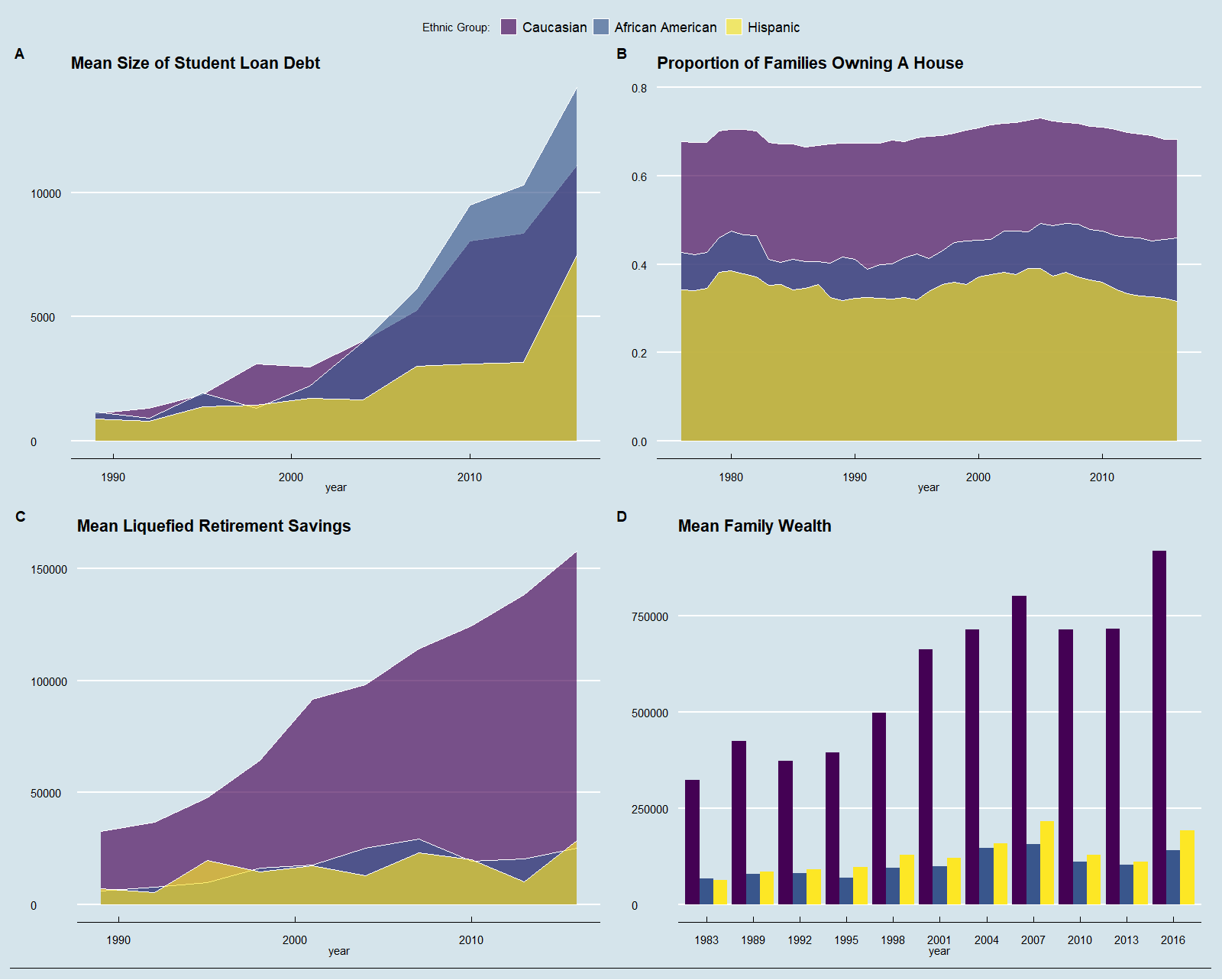
Wealth and Inequality
The plot below depicts various wealth and income data in the United States. More specifically, for each ethnic group they depict the change in time: (A) Student loan debt size, (B) The proportion of families owning a house, (C) The average size of liquefied savings, and (D) the average family wealth. An immediate insight drawn from the data is the consistent financial gaps between the three ethnic groups, favoring Caucasians, that only grew larger over time.